
A consistent feature vocabulary
Illustrations, card proportions, headings, and restrained colors create a shared structure across tools that perform very different jobs.
An interface concept that breaks a complicated migration-planning proposition into understandable tools, clear feature groups, and a guided next step.
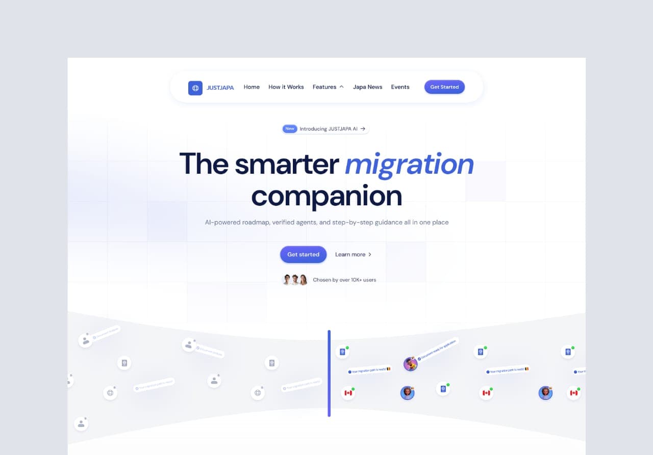
The JustJapa concept explores how a migration platform could introduce planning tools in a single web experience. The original designs cover a migration wizard, document analysis, budgeting, reminders, tasks, agent discovery, destination comparison, and document templates.
The engagement explores how those proposed services can fit into a clear web experience, with a visual structure that introduces the platform and explains its tools.
Concept screens include illustrative interface copy, sample profiles, and testimonial content. They do not represent verified users or product results.
Migration planning involves connected decisions about destination, eligibility, documents, costs, and timing. A website presenting those tools needs to show how they relate while keeping each one easy to recognise.
The main interface introduces the migration-companion proposition before presenting the individual tools. The first feature group gives each capability a dedicated visual and a short explanation, so a visitor can scan for the part of the journey that matters to them.
A second section provides more room for destination comparison and document support. Alternating layouts give those explanations space while retaining the same blue-led identity and soft interface treatment used throughout the concept.
Illustrations, card proportions, headings, and restrained colors create a shared structure across tools that perform very different jobs.
The composition moves from the high-level proposition into feature groups and then longer explanations. Each section adds detail rather than expecting the first screen to explain the entire platform.
Destination flags, document illustrations, notification cues, and checklist motifs give abstract capabilities a visible reference point.
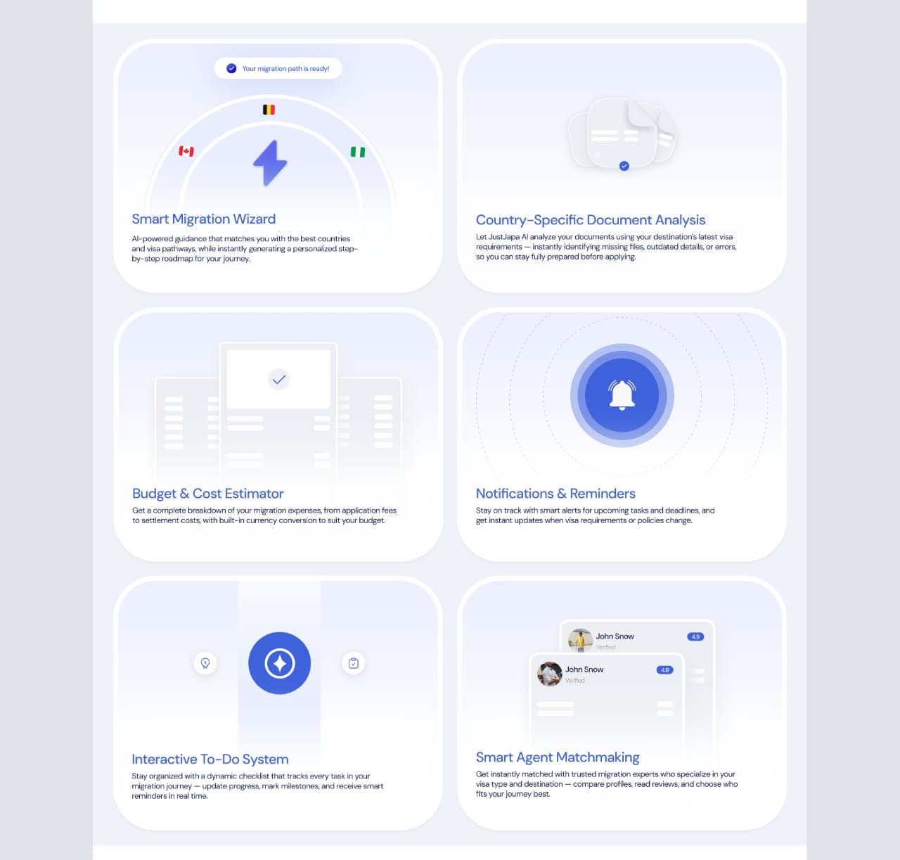
A proposed guided starting point for matching a person’s needs with destinations and possible pathways.
Concepts for country-specific document analysis, writing guidance, and reusable templates.
A feature presentation for estimating migration-related costs and helping a visitor plan ahead.
A proposed checklist and notification layer for keeping track of the stages of a migration journey.
A visual direction for comparing migration-support profiles within the product story.
A broader feature section that presents comparison as a separate, explorable planning task.
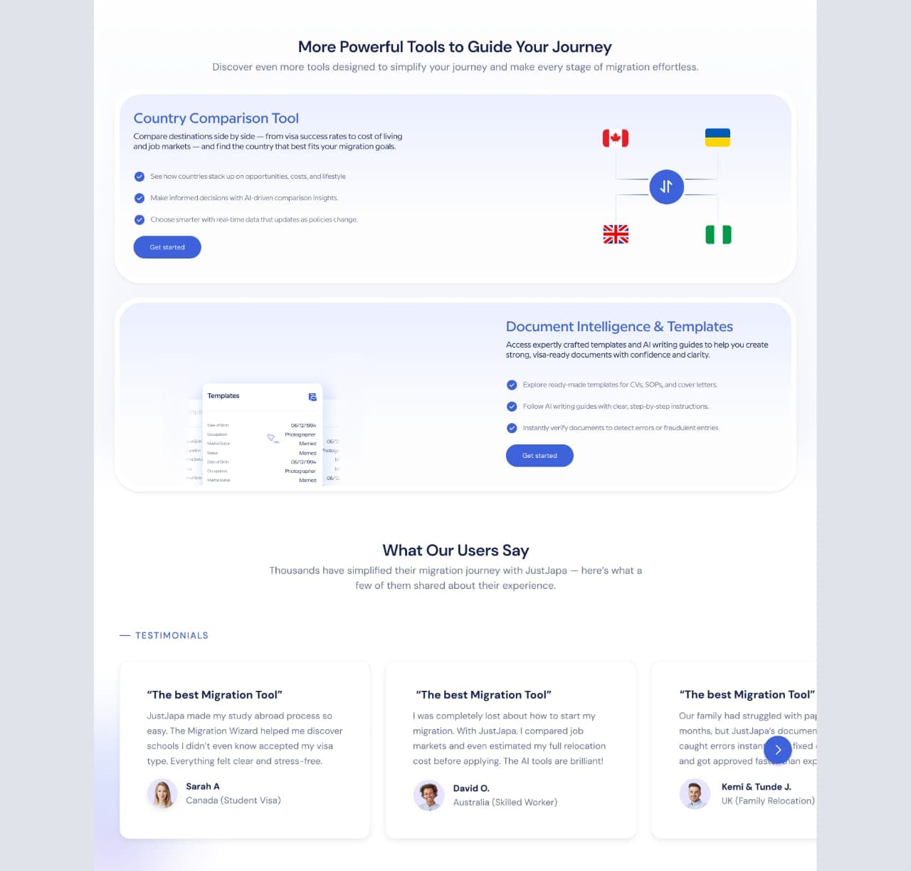
The web interface designs establish a direction for layout, feature grouping, illustrations, color, and product messaging.
The screens support the next stage of product definition by making the proposed feature set easier to discuss. They bring the planning tools and platform proposition into a shared visual direction for further refinement.
The concept makes the product idea visible and reviewable. It provides an interface language and a clearer feature narrative, with the original screens available to inspect.
A consistent blue-led interface direction.
Structured explanations of a broad planning toolset.
Original concept artwork preserved for review.
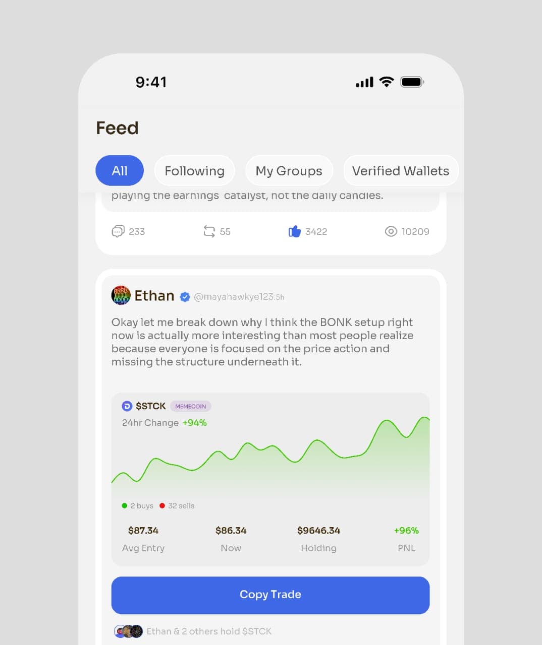
Fintech · Mobile UI/UX concept
Corporate · Landing page UI/UX
Tell us about your business, your goals and what you need. We’ll help you define the right next step.
Discuss your projecthello@apporal.digital